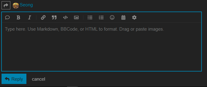
The colour of the text box being the same as the background colour can cause a lack of clarity for the website’s layout. A slightly different colour might be more useful for people (like me) who just meld the whole thing together because it’s the same colour. Probably something for the backburner.
1 Like
I think I can modify the colours by running the setup wizard again. I’ll make the text colour lighter so that the contrast is better.
1 Like
I’m looking into trying out some different Discourse themes.
If you guys see some you like, let me know here and I’ll check it out.
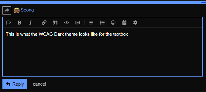
In the meantime @Mark, you can go into your Preferences (click your Avatar on top right) and then go to Interface and then pick WCAG Dark. It’s a bit ugly but it makes everything higher contrast, which will resolve the colour issues.
This is what the WCAG Dark theme looks like for the textbox
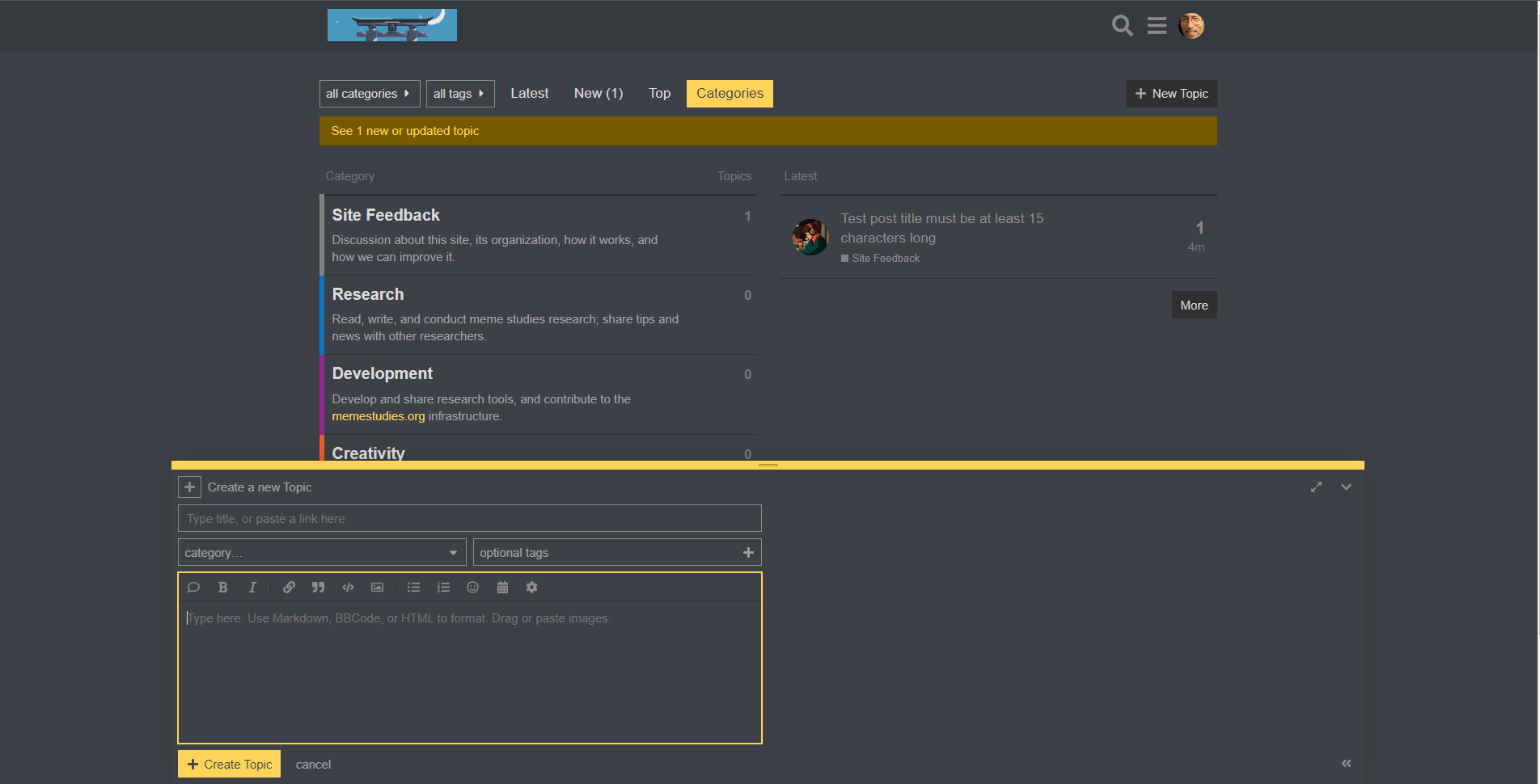
I've tried switching the site to the Dark theme. This is what it looks like: